

The Novelry’s New Logo





A long, long time ago, one weary author was writing and rewriting into the void, uncertain whether the long-overdue fifth novel was going in the right direction. She had the distinct feeling she was losing her mojo and, after 17 years of writing solo, felt isolated from humankind. So she dropped a note to a writer buddy and told him she was going to put some heat under her writing seat and write a draft in 90 days — and what’s more, she would call on other writers to join her for the marathon. His pithy reply: “You’re mad.”
And that’s how The Novelry was born. It was a blast! Full of energy and fun. To organize us, I set up a website sharpish. In search of a logo, I happened upon the octopus, a creature I was very fond of for its near-mythical qualities — but it also somehow seemed apt: the idea of one communal brain and many tentacles writing.
Next year, we’ll be celebrating ten years of writing together.
But the honest truth is, we have evolved since then. It’s no longer only about writing together, as it was when it was me and my fellow travelers. With our wider team of editors and authors, the focus now is on giving each and every writer the very best attention and care to progress their novel, their way. Each writer is different, every story different, and we tend to our writers as individuals, delivering classes and one-to-one guidance that works for them.
I see us as a garden where kindly gardeners bring water on the dry days and sunshine on the gloomy ones. As our tagline goes: we grow writers. We’re awfully pleased, proud, and honored to do so.
We should go into the years ahead with a logo that reflects that. So, we’ve been working on a new logo that mirrors the care each and every writer receives: a flower in bud.
Here’s the lovely thing about a bud: it is not a lesser flower waiting to become a better one. It’s already the flower — complete but folded, held safe until it’s ready to open. Given the right conditions, it simply unfurls. Which is what we believe about writers: the story is there inside you already. Our work is to help it bloom.
So, I’m pleased to reveal our new logo to you.
Our new logo
- The bud: the writer, the whole story folded within.
- The leaves, cradling the bud: our team and our community, holding the writer and the story, bringing the light and turning it into nourishment.
- The stem: the channel of our provision that carries the care upward — our teaching, guidance, and encouragement traveling from root to bud.
- And below it all, unseen, the roots: craft, and the long storytelling tradition every writer draws on.
- The bloom is the bud, opened: the author our writer becomes, the book ready for readers.
Our new logo is all about growth — the writer at the center of our efforts as a community. The palette is warm and human, encouraging rather than institutional. Where the octopus said we are doing this in haste, together, the bloom says we are doing this carefully; we nurture writers as individuals.
In a nutshell: we grow writers. And the new logo says so.
The new mark grew from my sketches and ideas, and the ideation took a polished turn thanks to the skills and eye of our Creative Director, Katie Khan. The final logo was brought to life by the hand of the illustrator Katie Tooke, who designs book covers for the major publishing houses — we are hugely grateful to her for interpreting our thinking in such a beautiful and cohesive way. It’s both elegant and happy. I hope you love it as much as we do.
So, farewell to the old octopus with thanks for the service, and hello to the bud in bloom. Here’s to the future: for beautiful tales, boldly told.
.avif)
.avif)


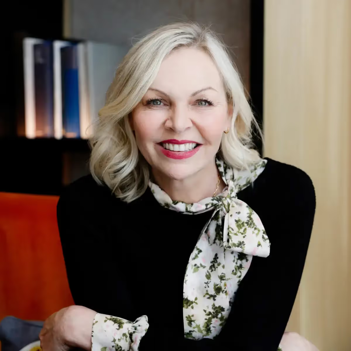
Louise Dean
Founder
Louise Dean is the Founder and CEO of The Novelry. Louise has been longlisted for the Booker Prize, and was the winner of Le Prince Maurice Prize and the Betty Trask Prize, as well as being nominated for other awards and a finalist for the Costa Book Awards short story prize. Louise graduated from Cambridge University in History and worked in advertising in London, Hong Kong and New York before becoming an author. Her novels have been published by Simon & Schuster and Penguin Random House worldwide. In 2017, the Bookseller announced a challenge for writers to join her to write their novels in ninety days, and The Novelry was born.
Please note: all genuine emails from Louise Dean will come from @thenovelry.com.
.avif)